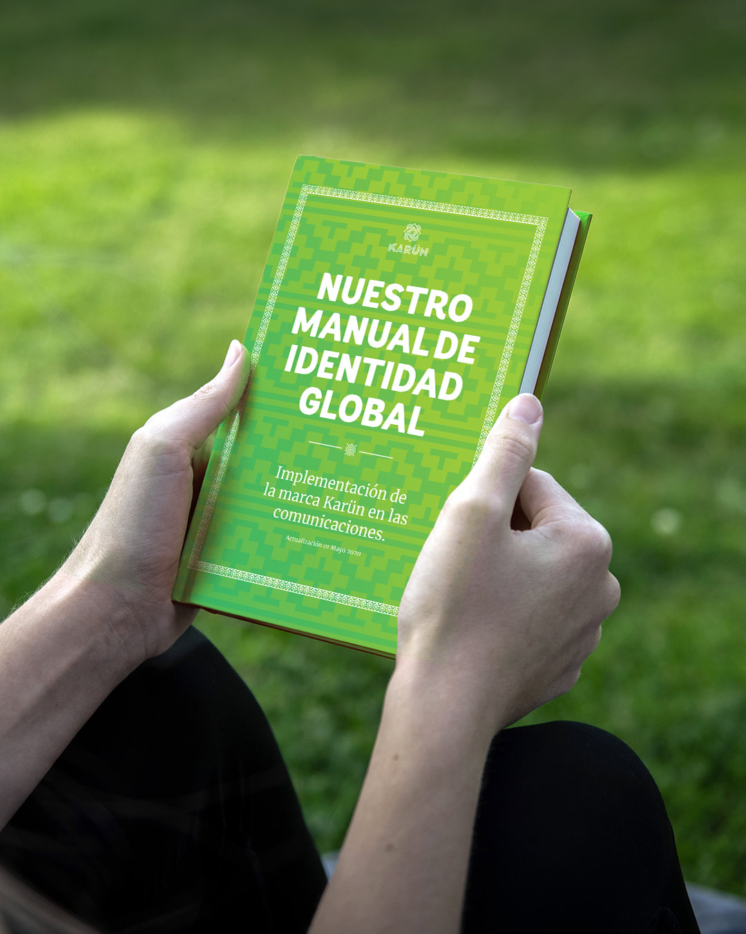
Branding
The purpose of this project is the creation from scratch of a corporate identity for a new communication agency specialized in social marketing. Their clients are organizations that work for a positive environmental and social impact.
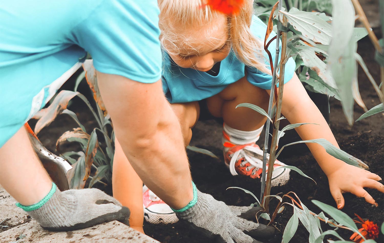
Photo by Anna Earl
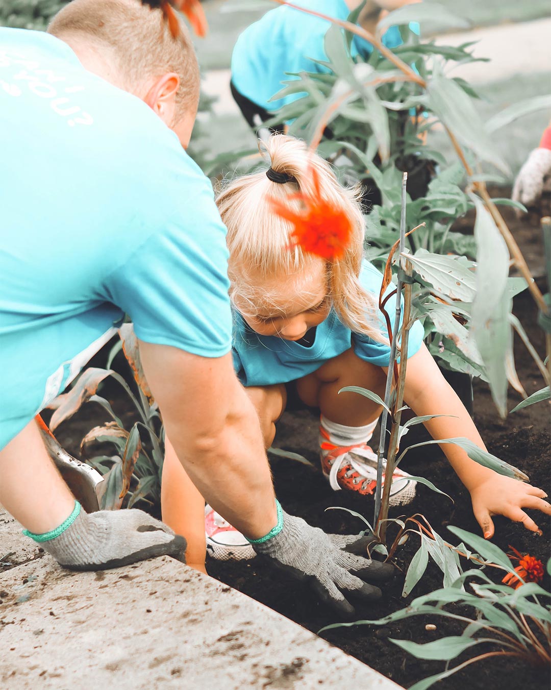
Photo by Anna Earl
In order to connect with the customer of the agency, we research their values and try to resemble him as much as possible and set ourselves apart from the competition at the same time.
Costumer
Competition
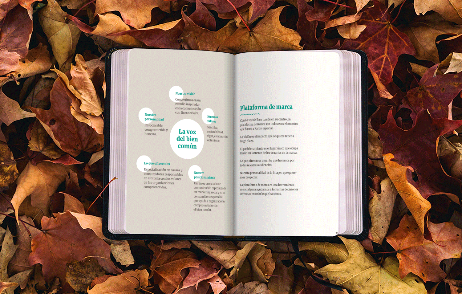
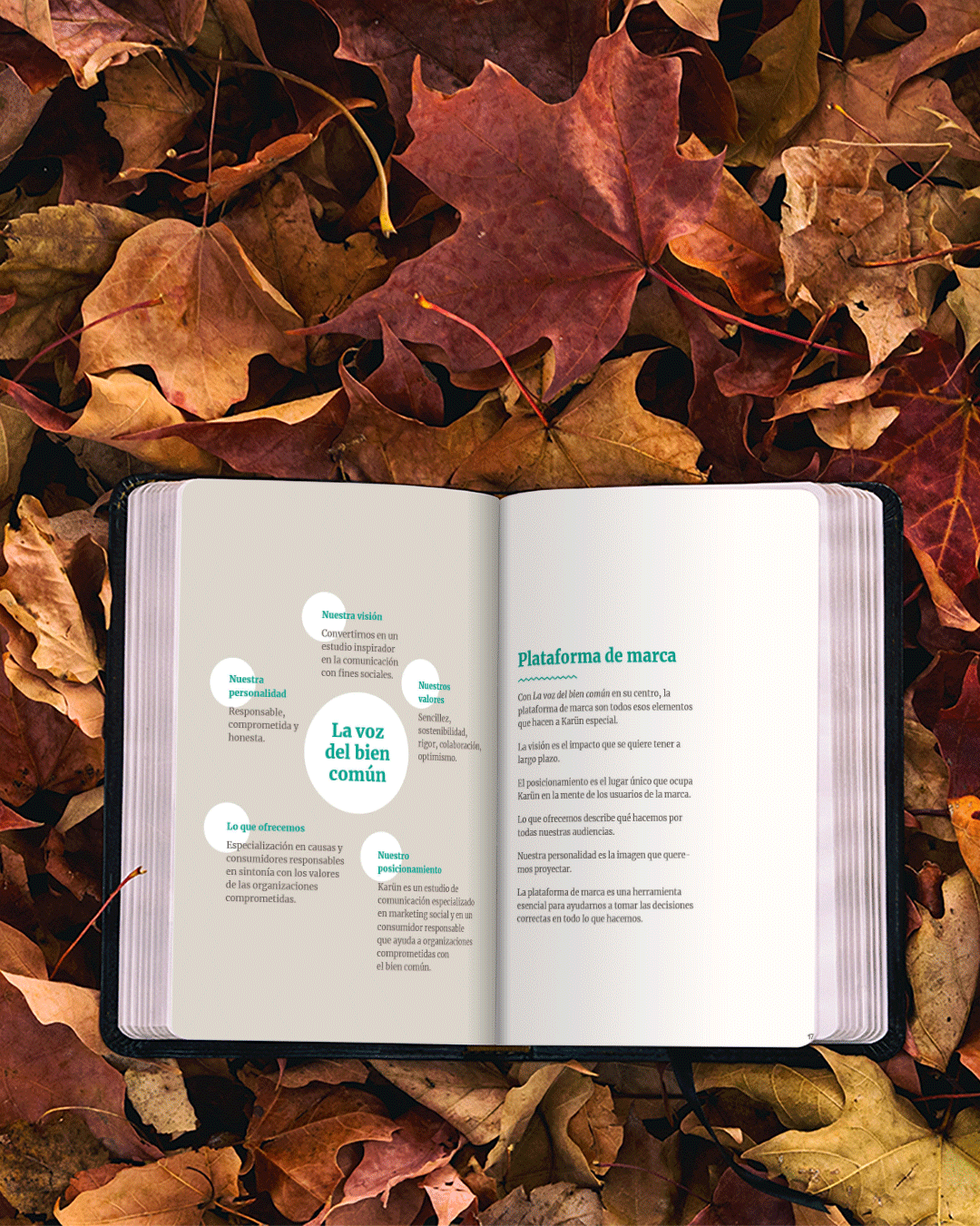
Our brand
Then, a concept is chosen according to the values of our potential clients to build the brand.
Coexistence between human beings and nature.
To graphically represent this concept, the indigenous peoples of South America are chosen because of their values towards nature.
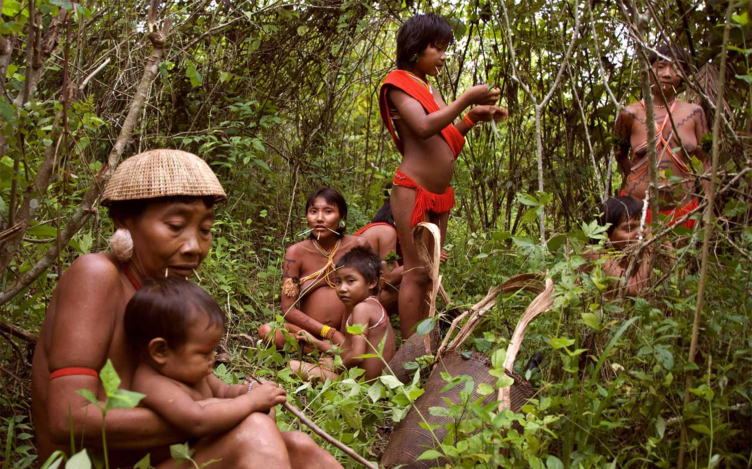
Photo by Fiona Watson, (Survival International)

Photo by Fiona Watson, (Survival International)
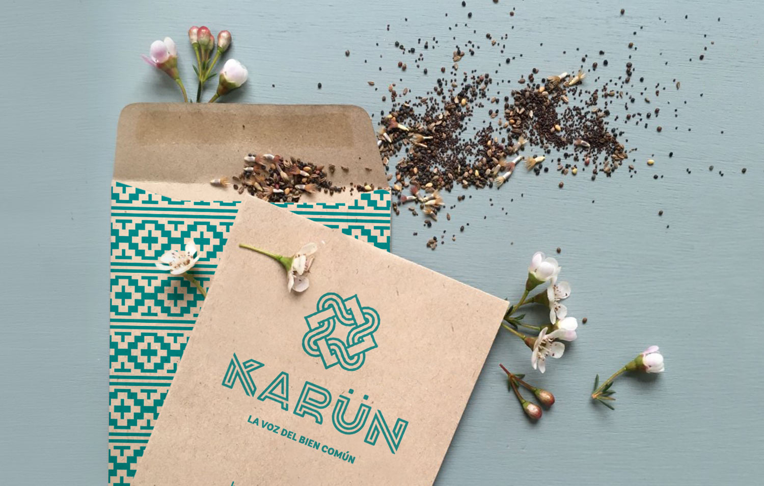
The name finally chosen is Karun, which means “to turn green” in the Mapuche language.
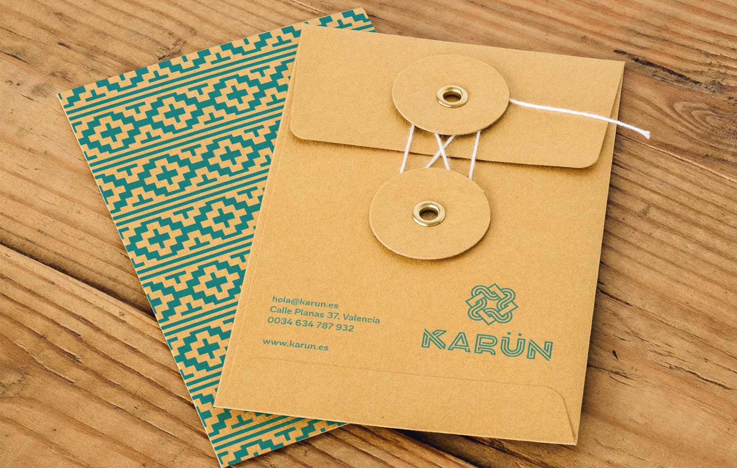
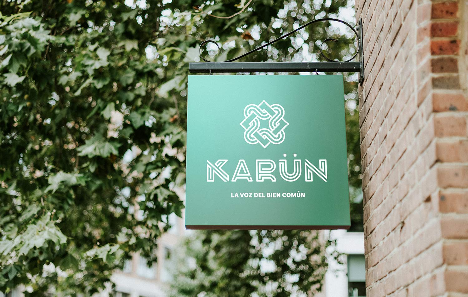
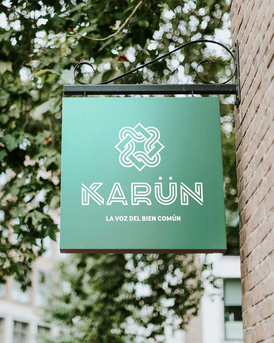
KARÜN
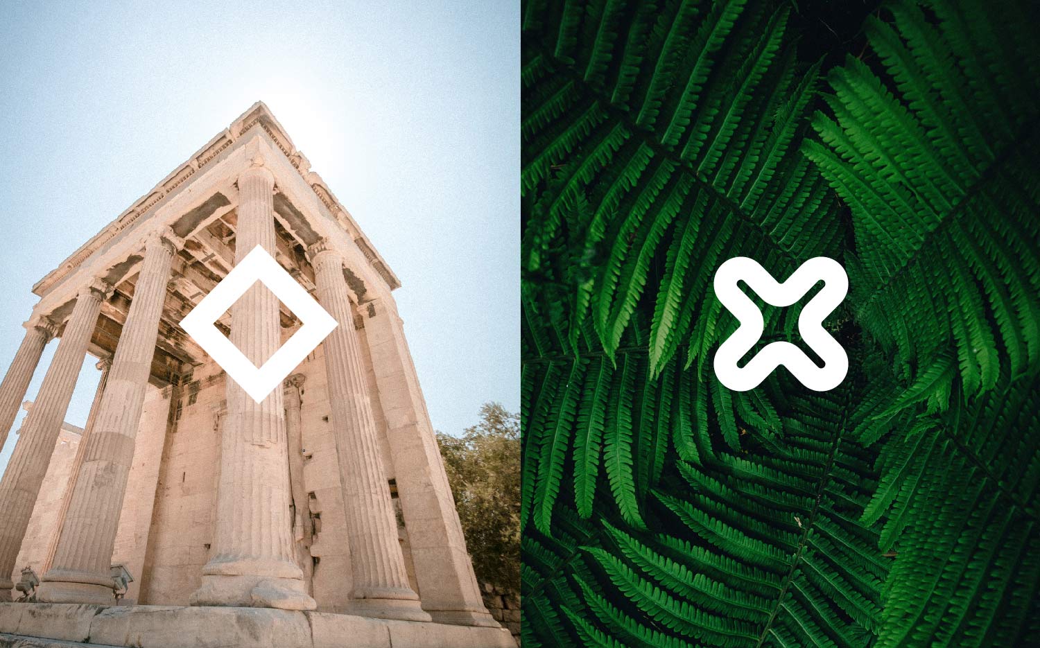
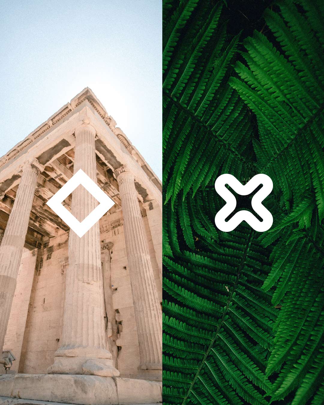
The isotype is made up of two shapes. An organic one represents nature and another rectilinear one that represents the human. Together they show the coexistence in balance between human beings and nature.


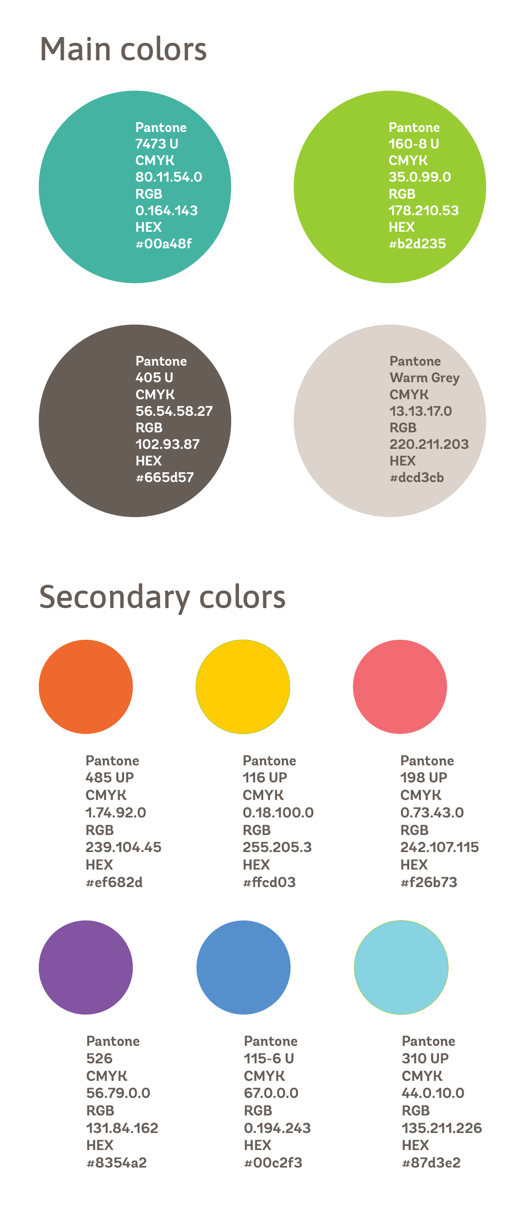
Keeping the main concept in mind typographies and colors are chosen.


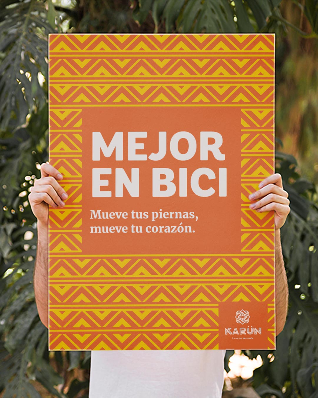
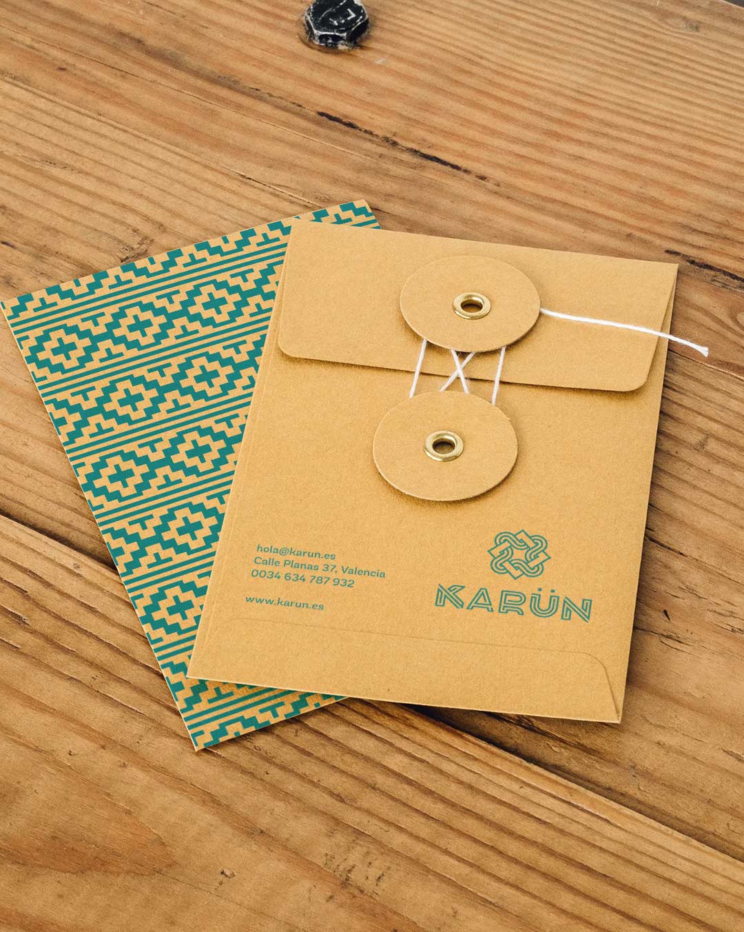
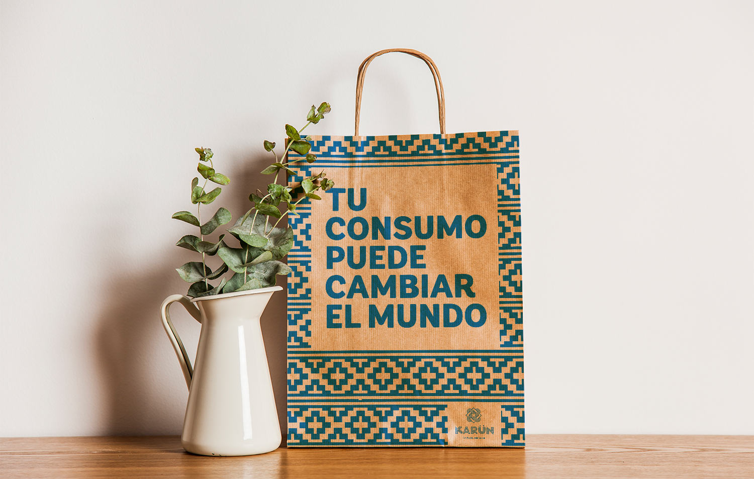
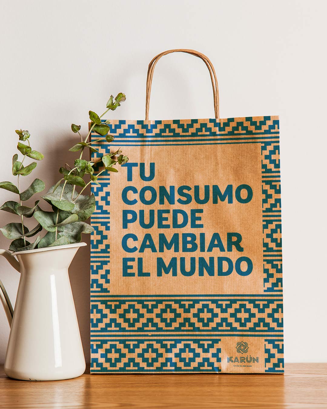
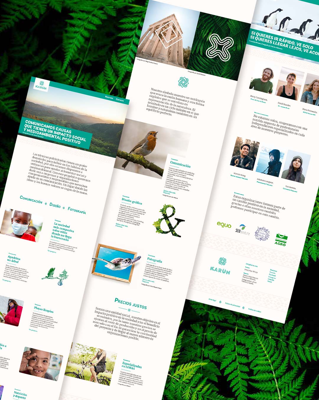
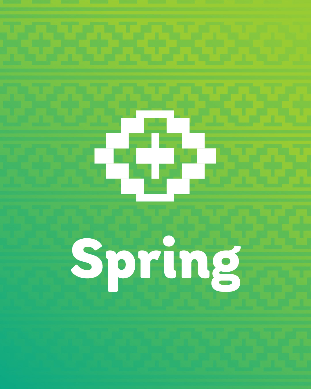
To make the brand more easily recognizable, a series of patterns are built according to the four seasons due to the importance they have for the Mapuche.


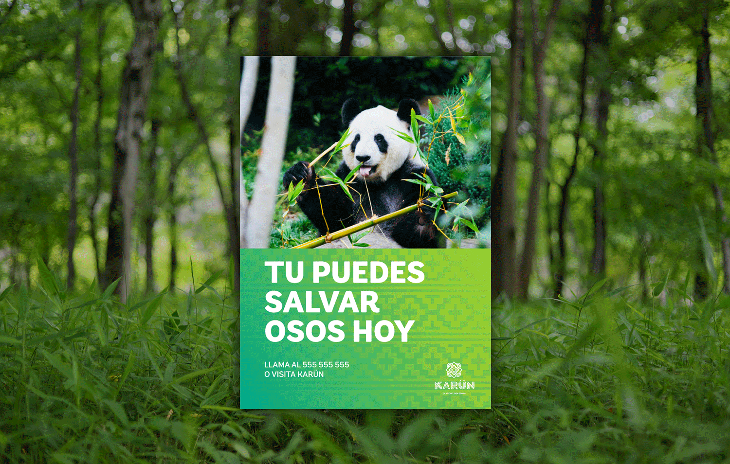
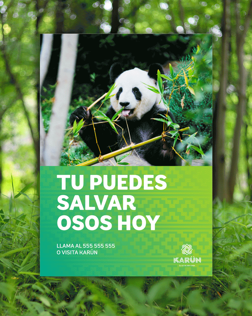
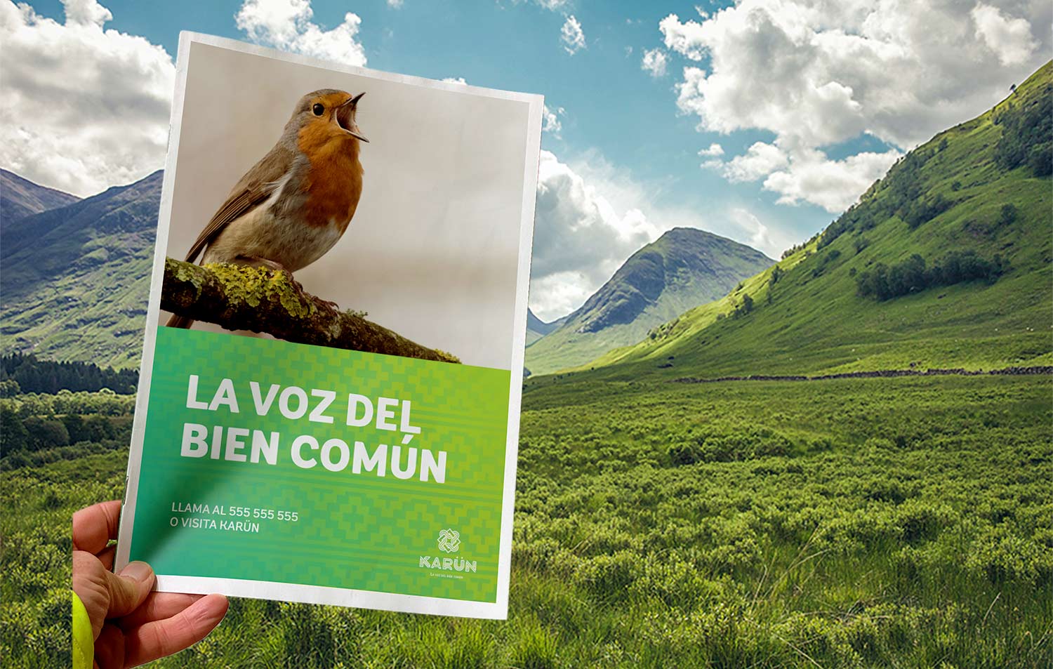
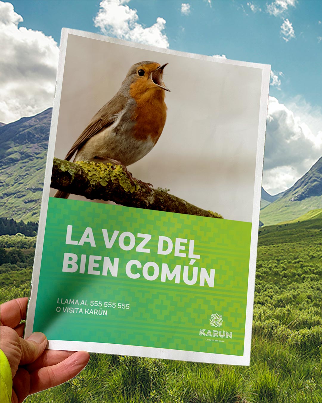
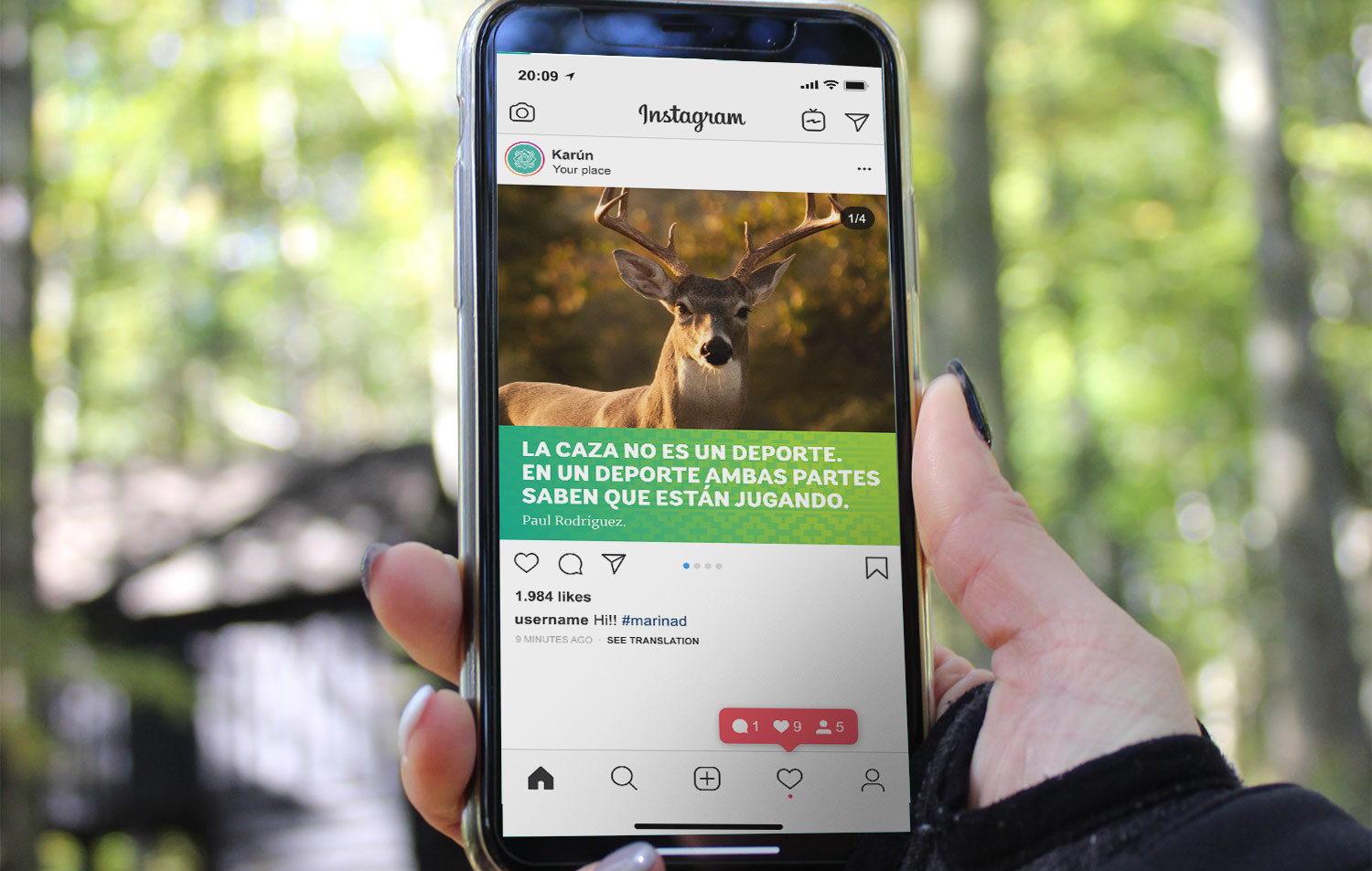
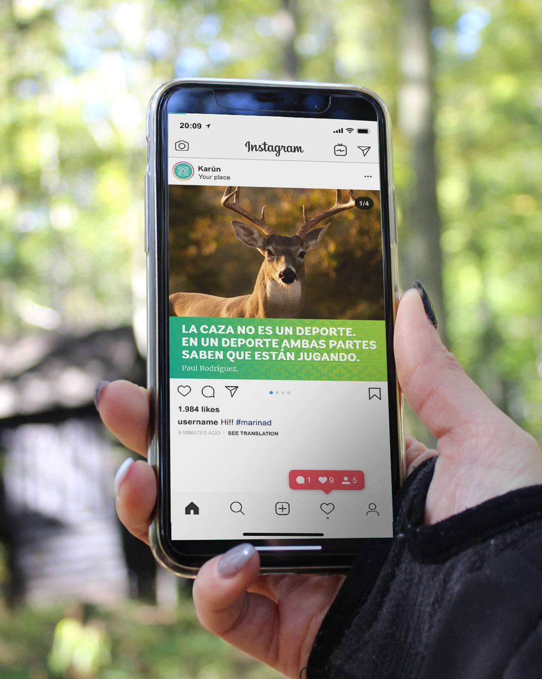
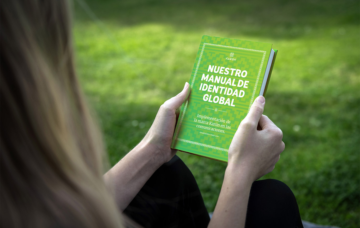
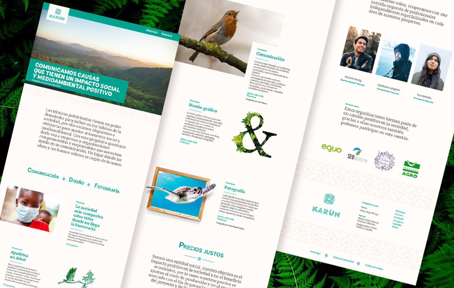
Eventually, we apply the brand to different media both online and physical.